I. Problem
When designing UIs, I often find it tedious and time-consuming to switch between light and dark themes or adapt designs responsively across devices—from mobile to tablet to desktop, and vice versa. I used to rely on other design systems, which made this process even more challenging.
Not long after, Figma introduced a game-changing feature: Variables. This quickly became one of my favorite and most useful tools. With Figma Variables, I can now build a design system that allows seamless theme switching (light ↔ dark) and responsive component resizing—all with just a single click.
This shift not only saved time but also improved consistency and reduced errors when collaborating with developers.
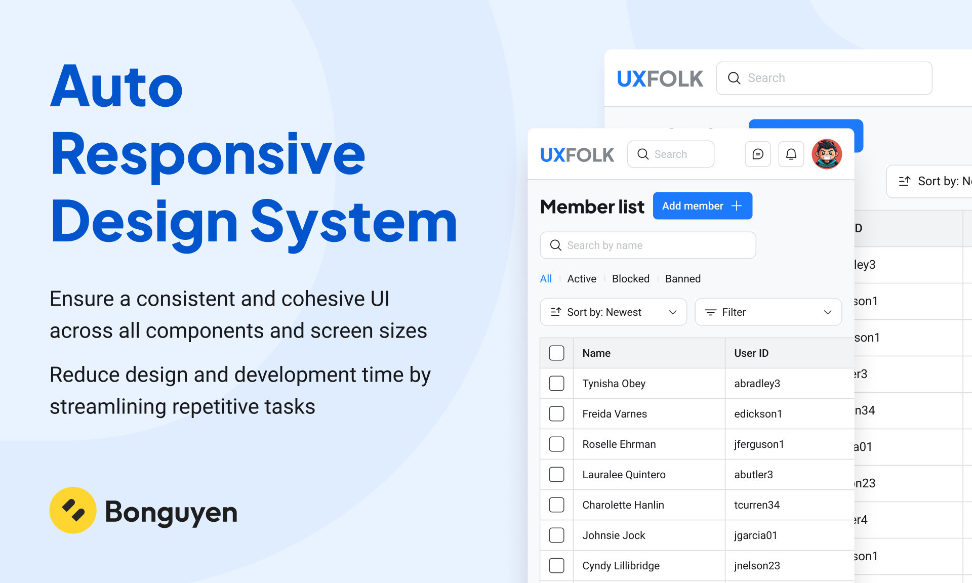
II. Goals of this design system
- Ensure a consistent and cohesive UI across all components and screen sizes
- Reduce design and development time by streamlining repetitive tasks
III. Design system architect
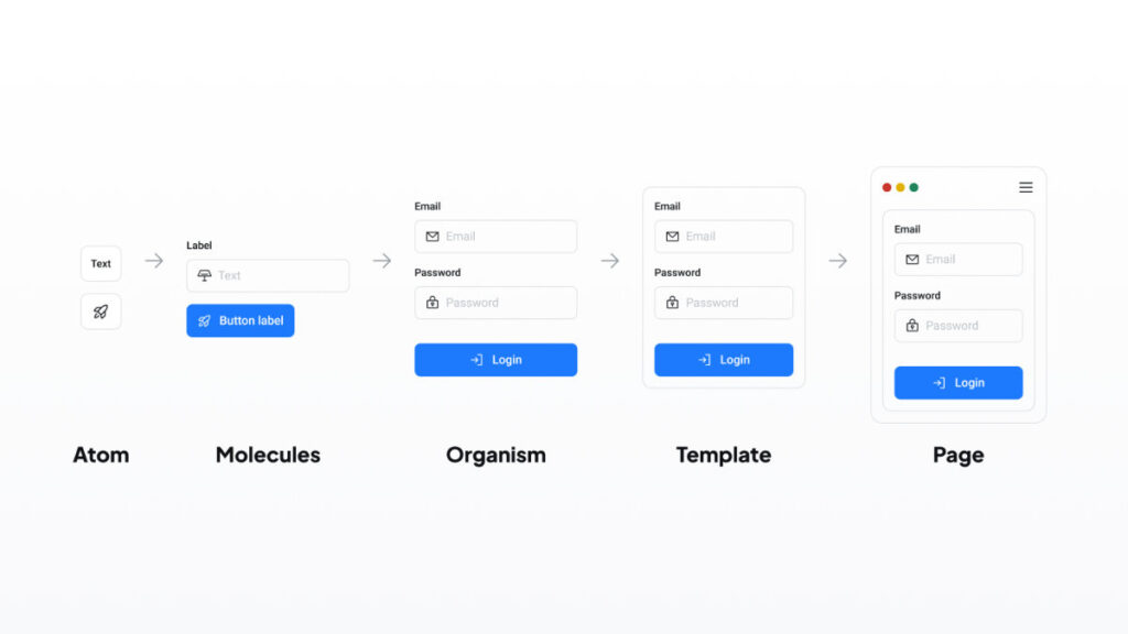
1. Atomic Design
My design system is built on the Atomic Design methodology. Atomic Design is a component-based approach that breaks the UI down into five levels: atoms, molecules, organisms, templates, and pages. This structure helps create a scalable and maintainable design system.
I chose Atomic Design because it promotes reusability, clarity, and consistency across the product. It makes it easier to organize components and helps teams work more efficiently by building interfaces from the smallest parts up.
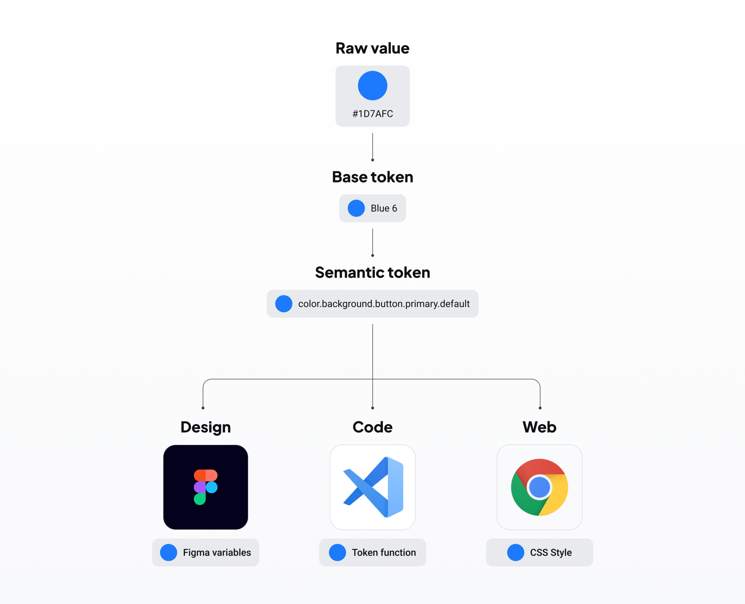
2. Design Tokens
My system also uses Design Tokens to manage the core values of the UI—such as color, spacing, typography, and border radius. Design tokens are centralized variables that make it easy to update and adapt the system.
I chose design tokens because they allow my design system to quickly adapt to changes. For example, I can easily switch between light and dark themes, or adjust responsiveness across different devices, simply by updating token values.
III. Token
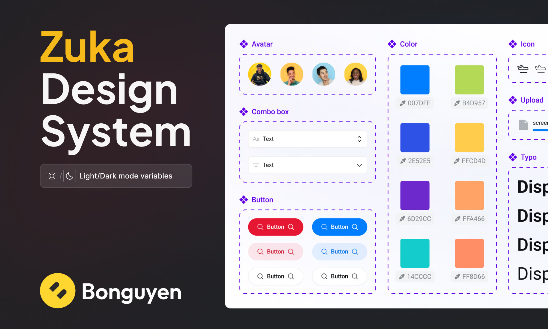
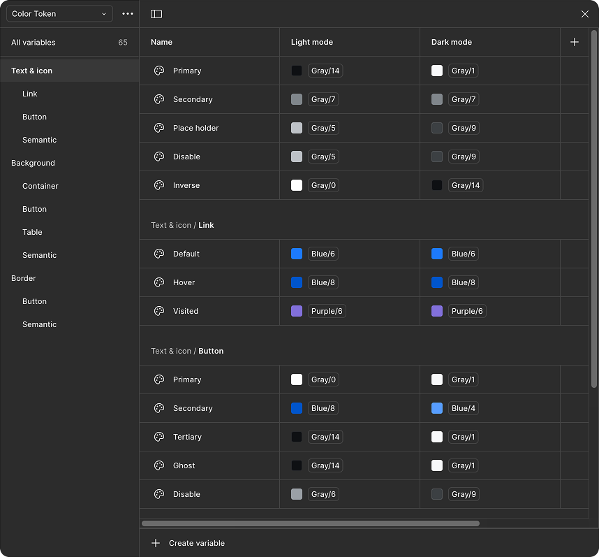
1. Color Token
I’ve developed a comprehensive yet streamlined color palette to ensure broad applicability across the system without introducing unnecessary complexity. This curated selection offers a variety of hues and shades, providing flexibility while maintaining consistency and ease of use.
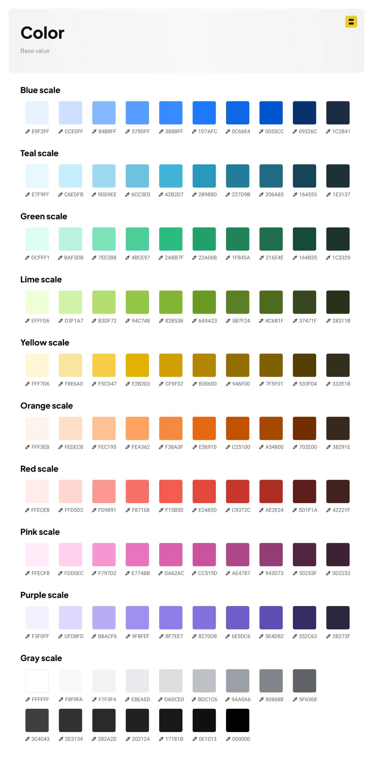
Using these raw color values, I’ve created color tokens specifically designed for seamless and rapid switching between light and dark themes.
I’ve organized these tokens into three primary categories, each with its own sub-categories, to suit various use cases:
- Text & Icon: Intended for general text elements such as body text or headers, as well as specific applications like text links, button labels, and semantic indicators.
- Background: Primarily used for designing container backgrounds, buttons, table backgrounds, and semantic elements.
- Border: Applied to general borders or in special cases, such as the borders of tertiary buttons or their hover/active states.
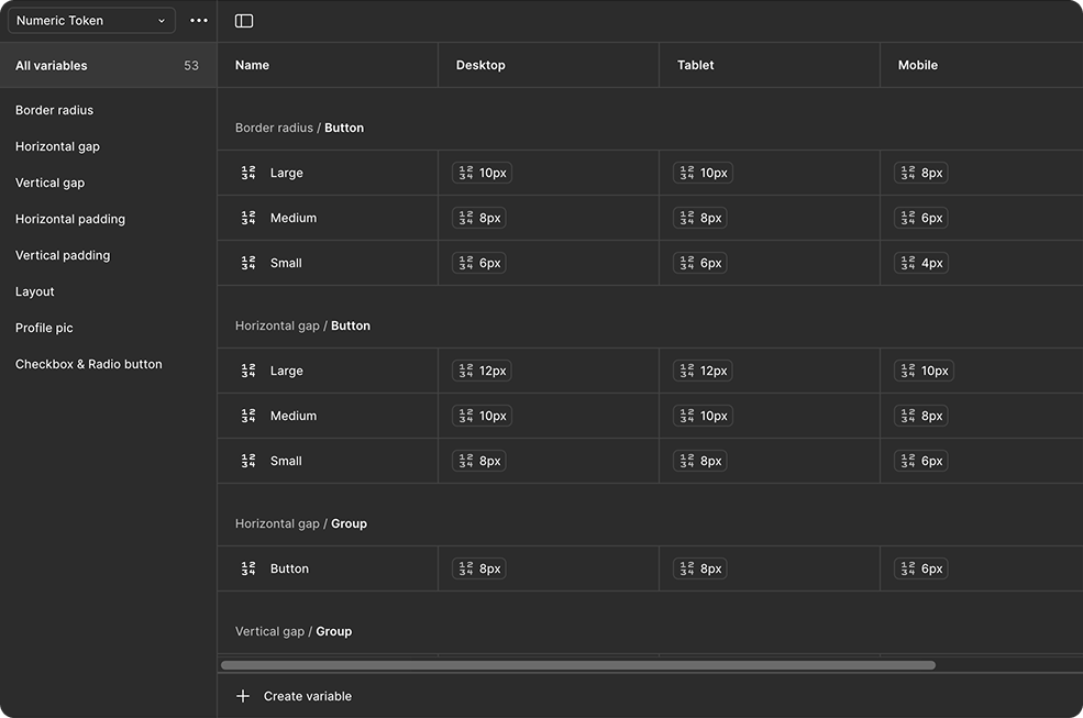
2. Numeric tokens
These values are designed to align perfectly with REM units, making it much easier for developers to implement. They can be used for tokens like font size and spacing, ensuring the system remains consistently aligned with the design.
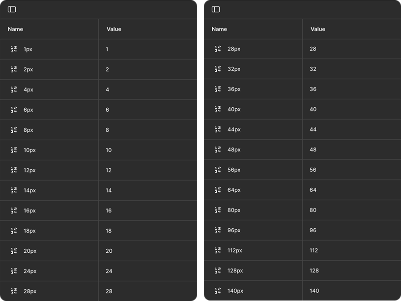
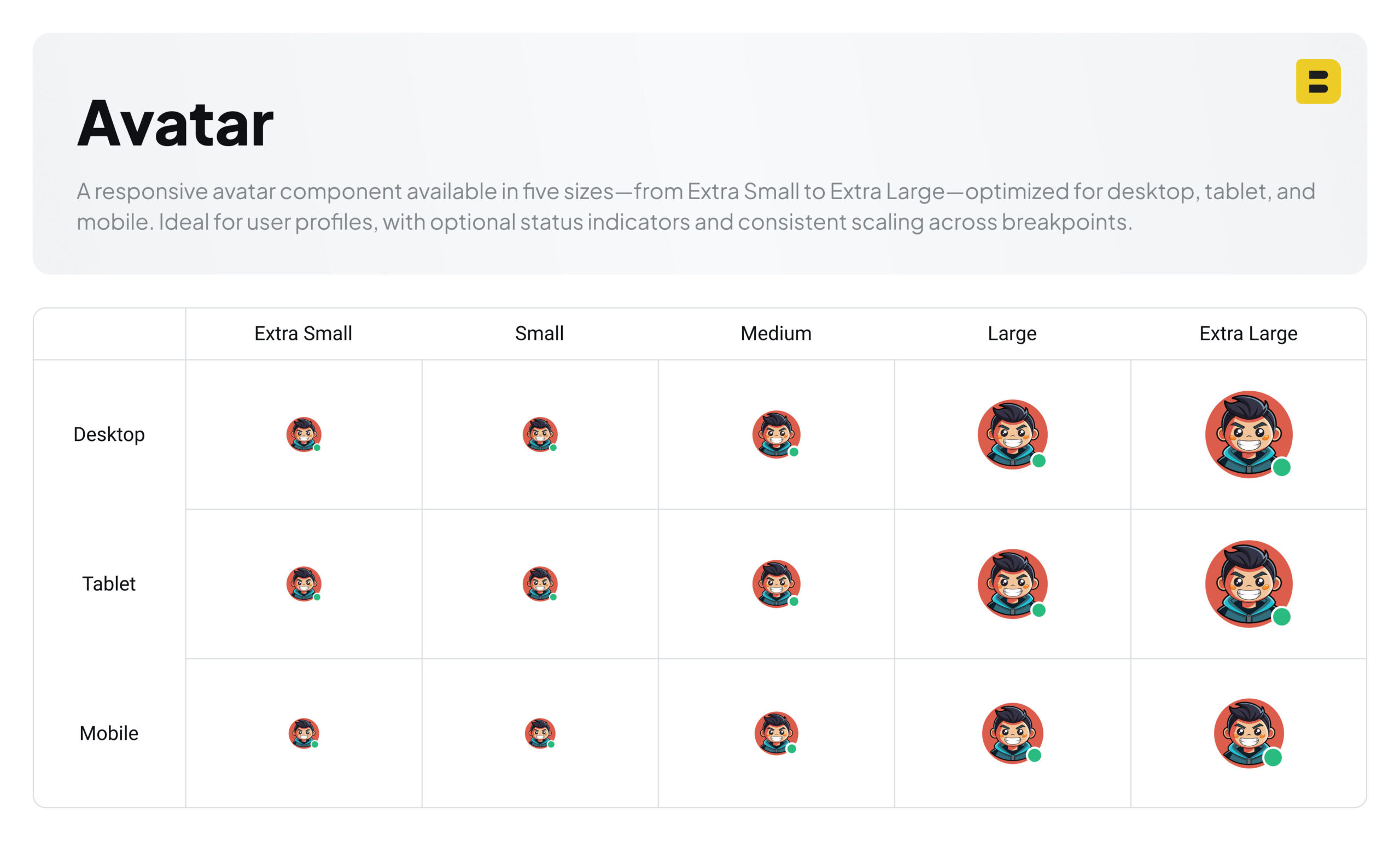
Numeric tokens are organized into distinct categories to align with various design purposes, such as border radius, spacing (gaps, paddings), layout configurations, and sizing. Each token features three primary variants, representing dimensions optimized for mobile, tablet, and desktop devices. This structured approach facilitates quick and seamless responsiveness of components and user interfaces across diverse screen sizes.
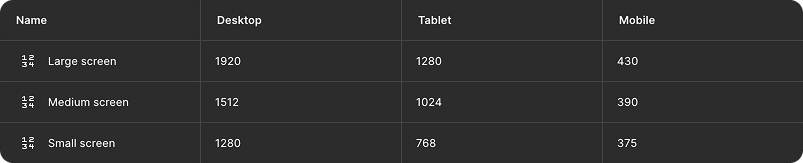
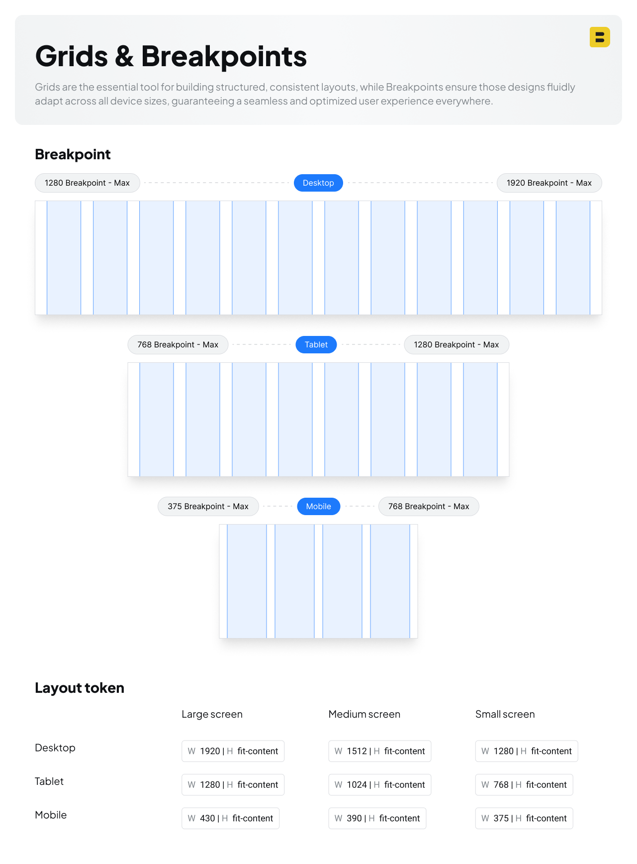
3. Layout
To accommodate diverse screen requirements, layouts are provided in three distinct sizes (Large, Medium, and Small), applicable across Desktop, Tablet, and Mobile devices.
III. Design system Foundation
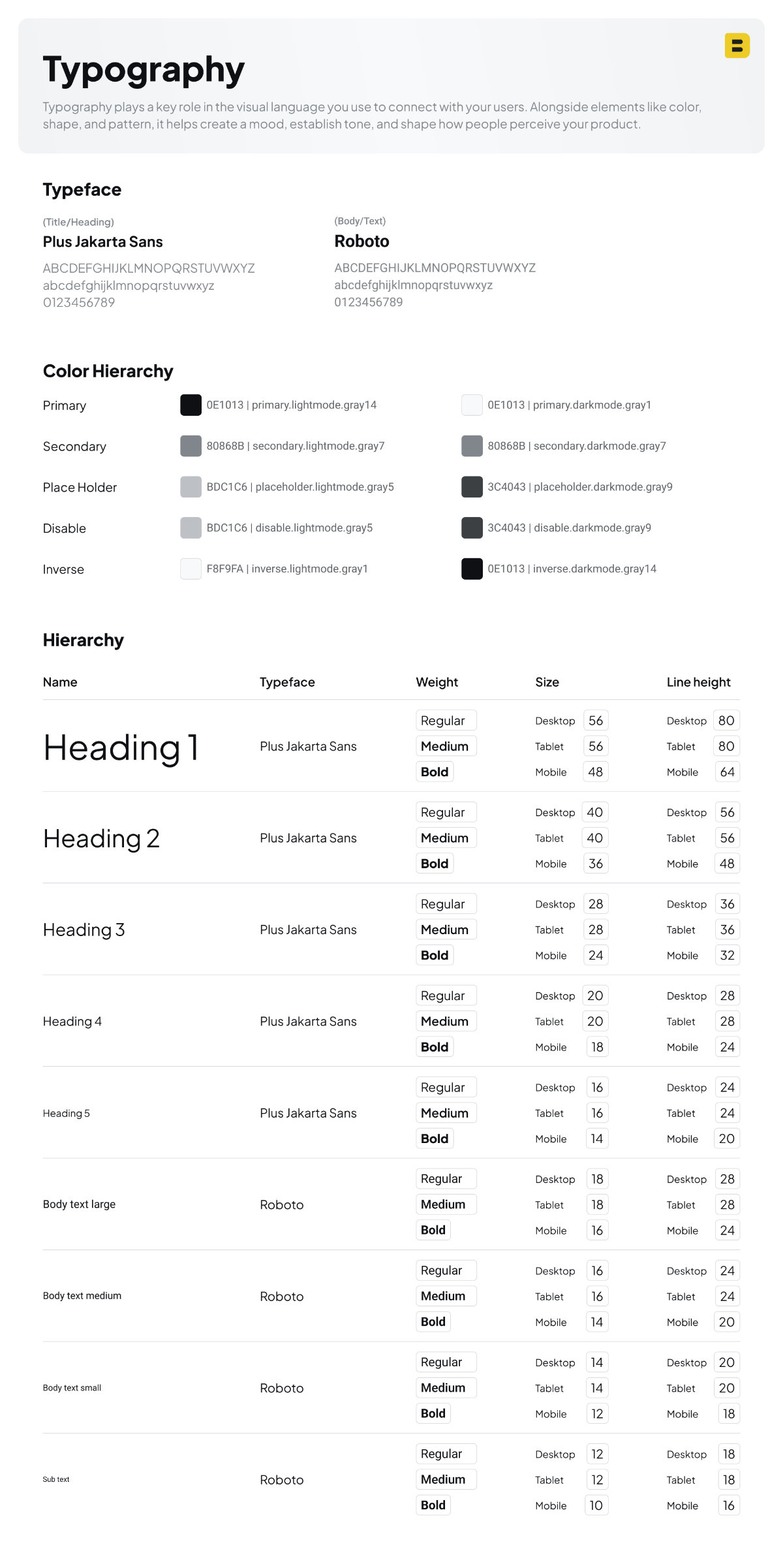
1. Typo
For my project, I chose Plus Jakarta Sans for titles and headings, and Roboto for body text. This combination strikes a balance between modern aesthetics and practical readability.
- Plus Jakarta Sans was selected for its clean, contemporary, and slightly geometric design. It gives a modern and friendly personality to headlines, making them stand out without being too decorative. Its proportions and visual rhythm make it excellent for drawing attention in titles, banners, and UI labels. However, because it has a bit more visual flair, it’s less suited for long-form reading—hence why it’s reserved for display use.
- Roboto is widely adopted and proven for body text thanks to its high legibility, neutral tone, and extensive multi-language support. It was designed by Google for digital interfaces, so it renders consistently across various platforms, devices, and operating systems. Roboto has a mechanical skeleton but open curves, making it easy on the eyes during long reading sessions. Its familiarity also creates a sense of trust and usability for most users.
By pairing these two typefaces, I ensure a user-friendly reading experience while maintaining a distinct visual hierarchy. Plus Jakarta Sans adds character and impact to headings, while Roboto keeps things accessible and legible throughout the content.
2. Icons
For the icons, I choose Phosphor Icons because they offer a consistent, modern look across different styles, making it easy to maintain visual harmony in my designs. Their wide variety of weights like thin, bold, and duotone which gives me the flexibility to adapt icons to different moods and contexts. Plus, they’re open-source, easy to customize, and work well across multiple platforms like React, Figma, and plain HTML. This makes them perfect for both design mockups and final production.
| Feature | Phosphor Icons |
|---|---|
| License | MIT, completely free |
| Icon count | 1,200+ (or more) |
| Style weights | Thin / Light / Regular / Bold / Fill / Duotone |
| Formats | SVG, icon font, framework libraries |
| Best for | Web + mobile UI/UX projects, presentations, design systems |
| Why use it | Lightweight, customizable, consistent visuals |
3. Grids & Breakpoints
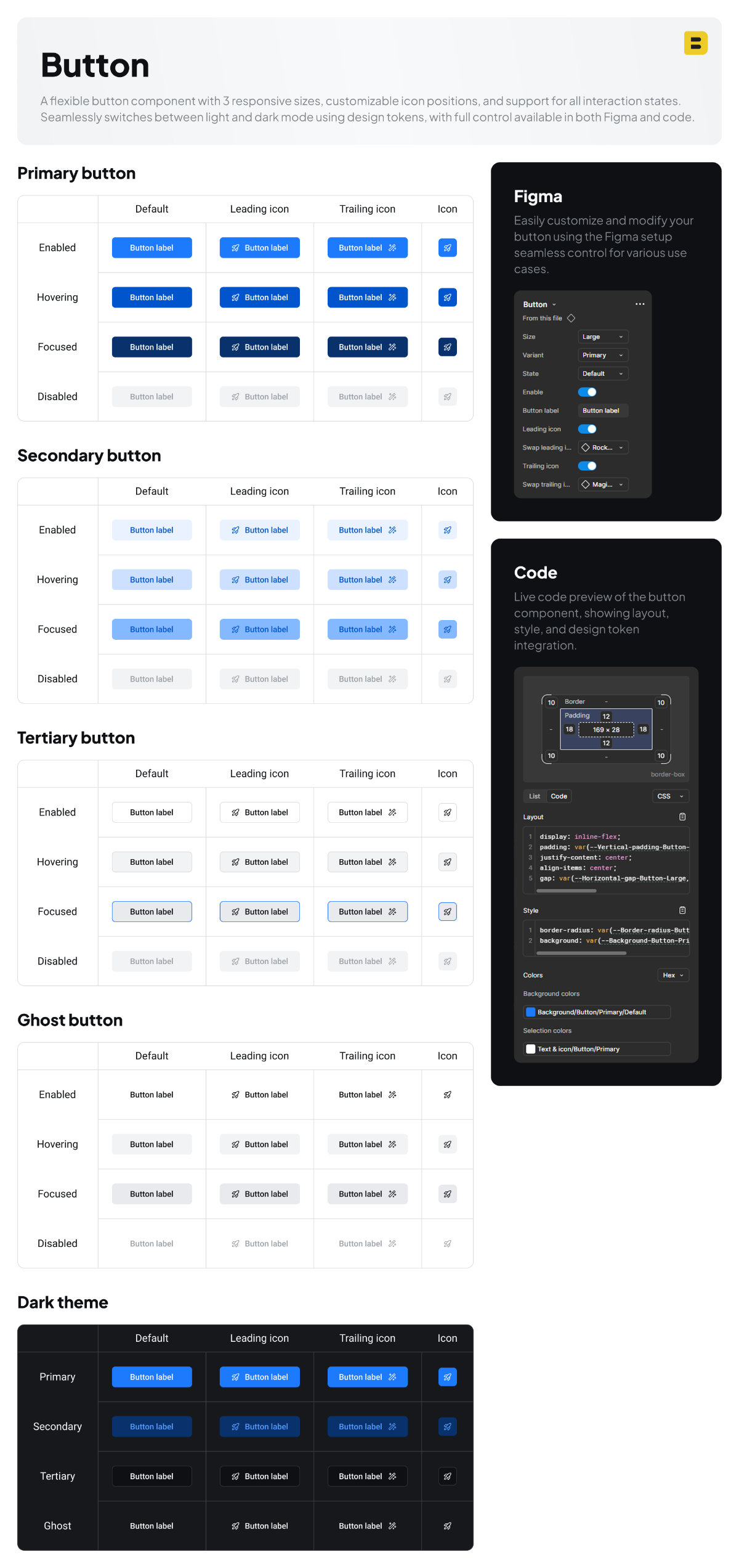
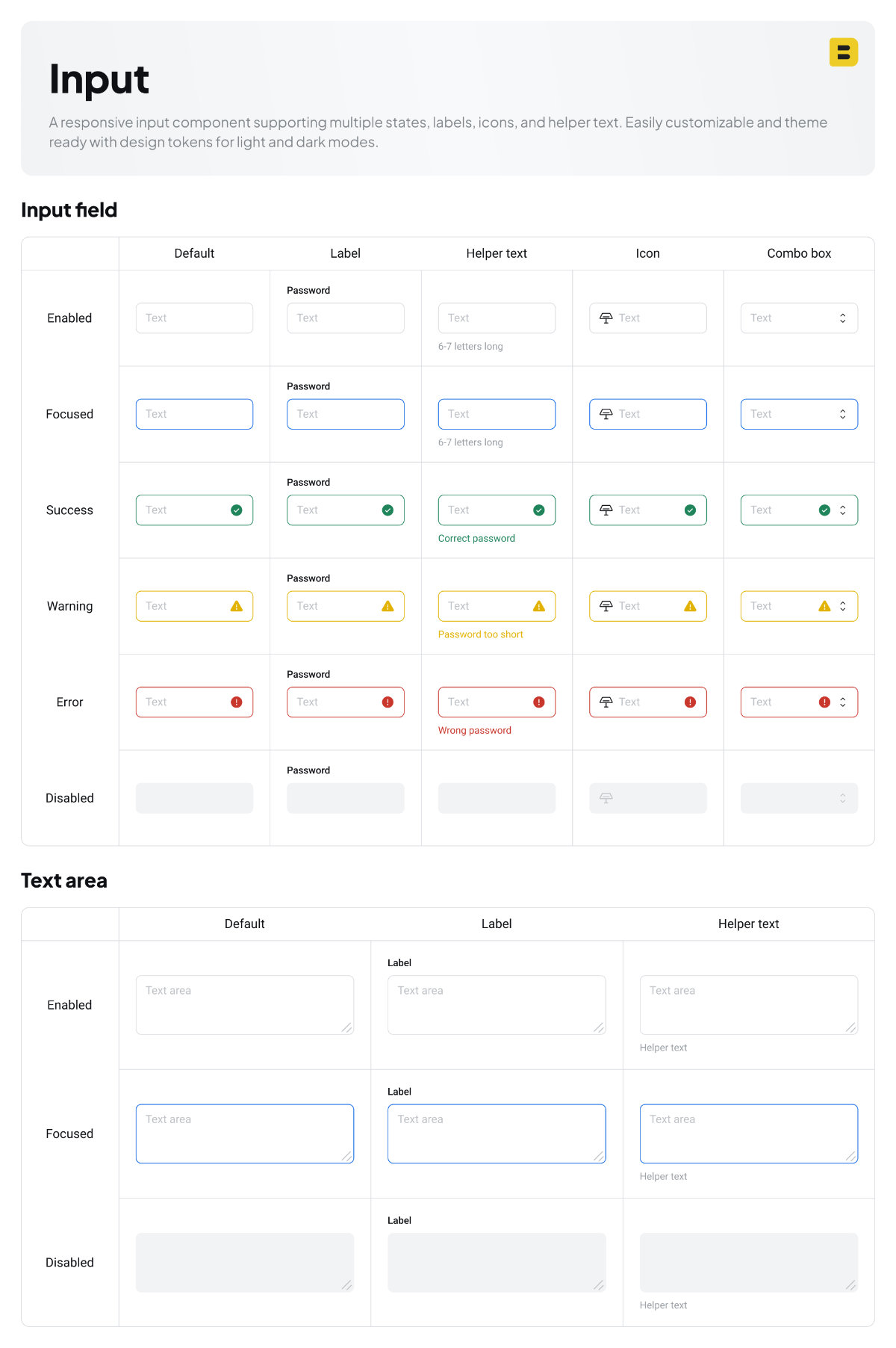
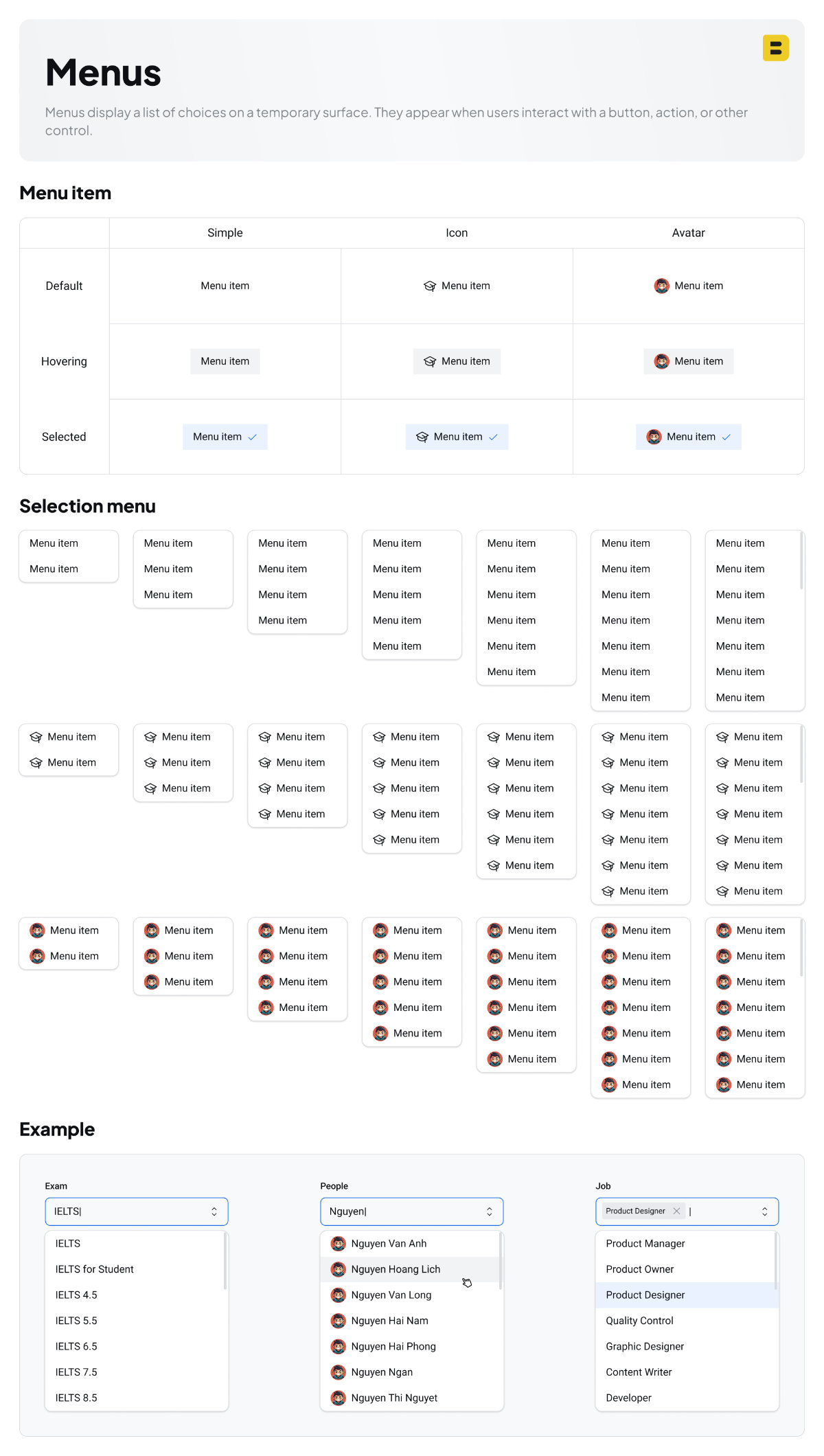
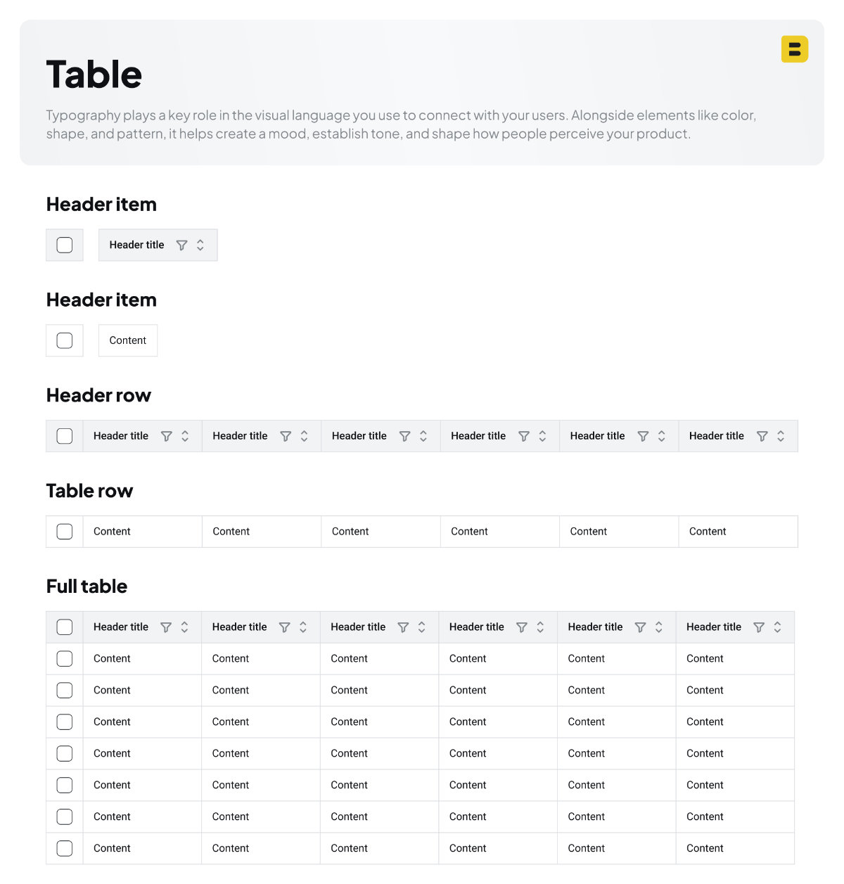
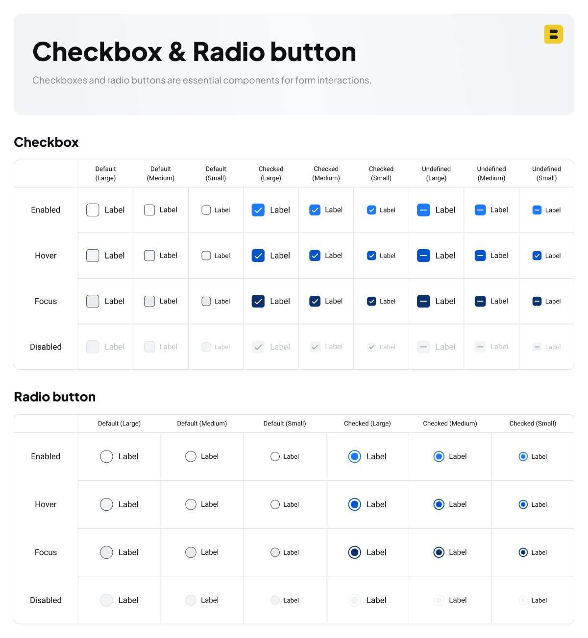
IV. Components
By applying design tokens to components, we can easily update their values as needed.
All components in my design system are built on top of these tokens and foundations, enabling seamless theme switching between light and dark modes, as well as responsive adaptation across desktop, tablet, and mobile.
This design system is built to grow alongside the project. As the product evolves, more components will be added to meet new design and development needs.
In the example below, I demonstrate how the design system is applied to create a user interface that scales intelligently. The UI automatically adjusts its layout, spacing, and typography to remain fully responsive across desktop, tablet, and mobile devices
If you’d like to explore this design system or try it yourself, you can access it directly through the link below.
You can also check out another design system I’ve crafted, which features seamless light and dark mode switching along with a wider range of fully designed components.