Overview
This page showcases the design systems I have built and contributed to throughout my career. Over the past five years as a Product Designer, I have had the opportunity to work on five different Design System projects, each with unique challenges and responsibilities.
- MWG Design System: A design system at Mobile World Group (Thegioididong). I joined the project as a supporting designer, focusing on building and maintaining reusable Figma components.
- ZIM Design System: The first Design System that I owned from start to finish. I was responsible for everything—from planning and designing the Figma library to collaborating with developers to implement the Design System in code, then continuously improving it through multiple iterations.
- CPS (Corporation Planning System) Design System: The first large-scale Design System I worked on for a complex enterprise management platform. The system was designed to be shared across multiple Scrum teams, each with its own designers and developers, requiring consistency and scalability.
- TMS Design System: A Design System for a Transportation Management System. I was responsible for creating, maintaining, and evolving the Design System to ensure consistency across the product.
- AMS Design System: A Design System for an Asset Management System. My role was to design, manage, and continuously improve the Design System to ensure a consistent and scalable user experience.
What I Learned About Design Systems
Working on multiple Design System projects has fundamentally changed how I think about Design Systems. The biggest lesson I learned is that a Design System does not live in a Figma file.
A Figma library is primarily a tool for designers. It helps maintain visual consistency, speeds up UI design, and improves communication between designers and developers. In my opinion, it is better described as a UI Library rather than a Design System.
An actual Design System lives in code, where reusable components become part of the real product. Only then can it truly improve consistency, development speed, and long-term maintainability. This is a common misconception among junior designers—and honestly, it was one I had when I first started as well.
Another important lesson is that a Design System is much more than colors, typography, spacing, and components. A mature Design System should also define:
- Design principles
- Interaction rules
- User behaviors
- System responses
- UX patterns
These standards ensure that users experience the same behavior throughout the product, regardless of which screen or feature they are using.
Showcase
To demonstrate my approach, I’ll walk through two of the five Design Systems that I have built.
I. ZIM Design System
Background & Problem
When I joined ZIM in May 2023, I found that the products already had a strong visual design, but there was no functional Design System in place. As a result, I frequently had to recreate UI elements manually. The challenge became even greater because every screen needed to support:
- Desktop
- Tablet
- Mobile
- Light Mode
- Dark Mode
Every UI change required manually updating multiple screen sizes and both color themes, making both design and development time-consuming. To solve these issues, I proposed building a centralized Design System.
Design Goals
- Reduce design and development time
- Ensure visual consistency across all ZIM products
- Support responsive design
- Allow effortless switching between Light Mode and Dark Mode
- Improve collaboration between designers and developers
My Impact
As the owner of the Design System, I collaborated closely with graphic designers and developers throughout the project. Using the Atomic Design methodology together with Figma’s newly released Variables feature, I successfully built a scalable Design System that reduced both design and development time by approximately one-third.
The Design System
Color Variables (Design Tokens)
I introduced color tokens using Figma Variables. Each token contained both Light Mode and Dark Mode values. Every component referenced these tokens instead of fixed colors. As a result, switching between themes became as simple as changing the Variable Mode, allowing the entire interface to update automatically.
| Token Name | Light Mode | Dark Mode |
|---|
Responsive Grid & Breakpoints
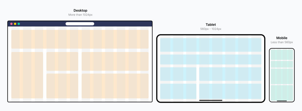
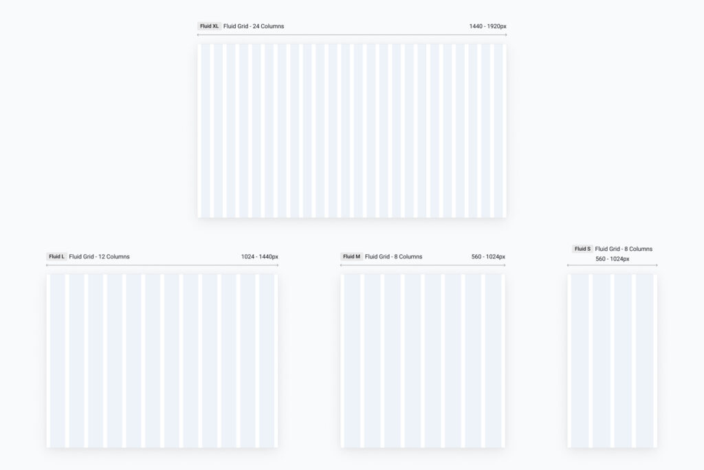
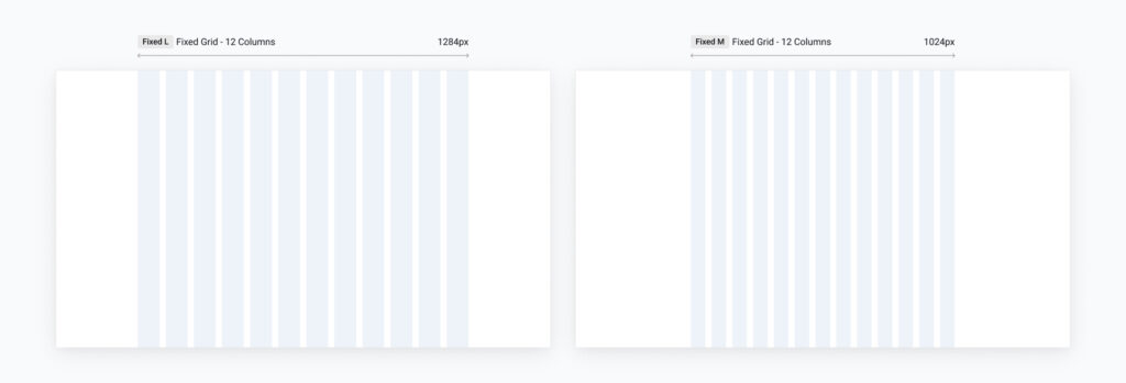
To support responsive layouts, I established a consistent breakpoint system for desktop, tablet, and mobile devices.
Instead of relying soly on fixed-width layouts, I implemented fluid grids along the side to flexiable use on any screen size and UI containers, allowing interfaces to adapt naturally across different screen sizes while maintaining visual consistency.
Components
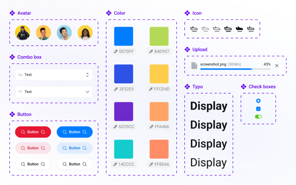
The Design System contains over 1,580 reusable components covering a wide range of UI scenarios.
Each component supports multiple sizes and variants, making it easy to build responsive interfaces while reducing repetitive work. Designers can quickly adapt layouts for different devices, and developers benefit from a consistent, reusable component library.
Component Naming & Properties
A well-structured Design System is not just about creating reusable components—it also requires a consistent naming convention and component architecture.
When designing components, I ensure that the component names, variants, and properties in Figma closely match the naming used in the developers' codebase.
This alignment creates a shared language between designers and developers. When developers inspect a design, they can quickly identify the corresponding component and its properties in the code, reducing ambiguity, speeding up implementation, and minimizing communication overhead.
By treating Figma as a reflection of the actual component library, the handoff process becomes more efficient and helps maintain consistency between design and the final product.
II. CPS Design System
Background & Challenges
The Corporation Planning System (CPS) is an internal enterprise platform at CyberLogitec. It supports a wide range of business operations, including finance, accounting, invoicing, revenue management, contracts, and human resources.
Because of its scale and complexity, the product was developed by six Scrum teams, each consisting of approximately:
- 3 Business Analysts
- 1 UI/UX Designer
- 1 Scrum Master
- 2 Quality Control Engineers
- 5 Developers
With multiple teams working on different parts of the product, maintaining a consistent user experience became increasingly difficult.
The situation was further complicated by the project's development process. Rather than working simultaneously, Scrum teams joined and left the project over time. Once one team completed its assigned modules, another team would continue development with limited documentation or design handover. By the time I joined the project, two Scrum teams had already contributed to the system.
After auditing the existing product, I identified several key challenges:
- Each Scrum team had developed its own UI patterns and design decisions.
- Every designer maintained a separate UI library, resulting in duplicated components and inconsistent styling.
- There was no centralized Design System or governance process.
- Components with the same purpose often looked and behaved differently across modules.
- Designers and developers lacked a shared source of truth, making collaboration increasingly difficult as the product grew.
Recognizing that these issues would only become more expensive to fix over time, I proposed building a centralized Design System and volunteered to lead the initiative.
Design Goals
The project focused on balancing speed, scalability, and maintainability.
The goals were to:
- Build a centralized Design System as quickly as possible without disrupting ongoing development.
- Standardize the user experience across all Scrum teams.
- Minimize the amount of redesign required for existing screens while gradually improving consistency.
- Create a Design System that was easy to maintain and evolve over time.
- Establish a collaborative workflow that enabled multiple designers to contribute, review, and continuously improve the Design System together.
My Impact
As the owner of the Design System initiative, I worked closely with designers, Business Analysts, and lead developers across multiple Scrum teams.
I audited existing products, identified common UI patterns, and consolidated them into a centralized component library and design foundation. Rather than forcing teams to redesign everything from scratch, I carefully designed components that were compatible with existing interfaces, significantly reducing migration effort while improving consistency.
Beyond creating the Design System itself, I also established a collaborative workflow that enabled designers from different Scrum teams to:
- Share a single Design System library.
- Contribute new components and improvements.
- Review proposed changes together.
- Maintain consistency across the entire platform.
This transformed the Design System from a collection of reusable components into a shared design language that supported collaboration across the organization.
A detailed breakdown of my process, implementation strategy, and migration approach will be available in a dedicated case study. (Coming soon.)
The Design System
Variables & Design Tokens
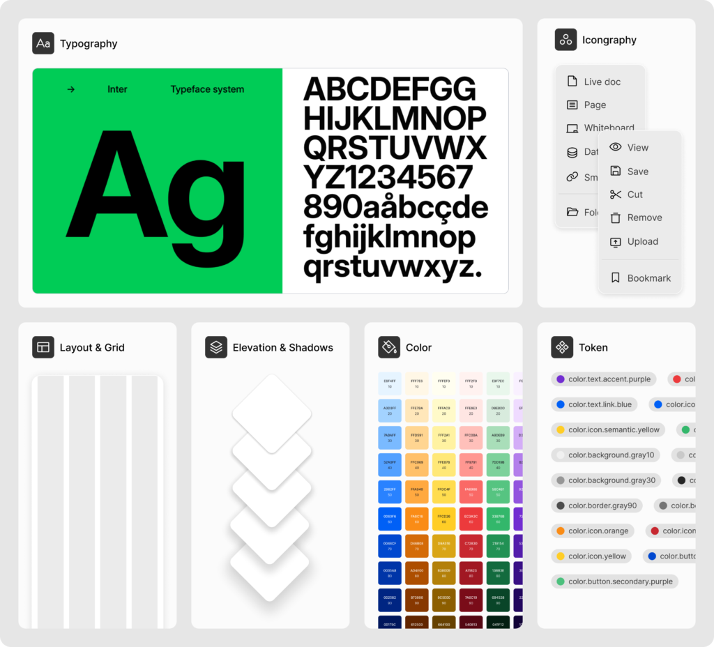
A centralized token system was created to standardize colors, typography, spacing, elevation, and other design foundations. This allowed visual changes to be managed consistently across the entire platform while simplifying future maintenance.
Foundations
The foundation layer defined the core design language, including color, typography, spacing, grids, icons, elevation, and responsive behavior. These standards served as the building blocks for every product team.
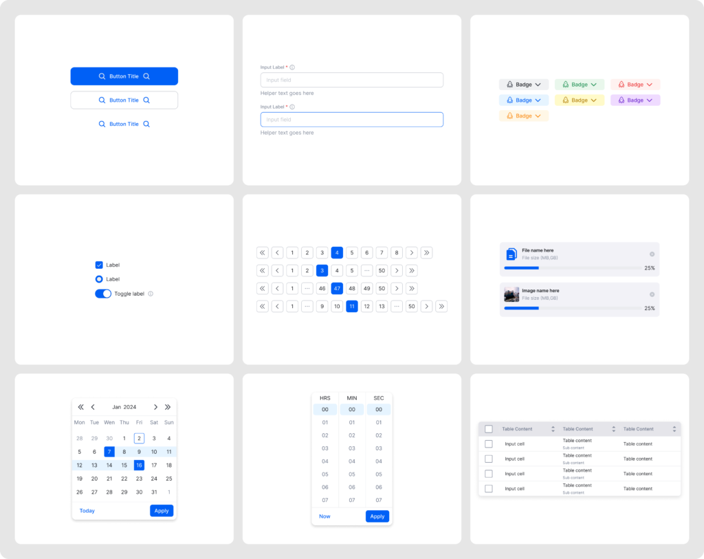
Core Components
Reusable components were built with scalability and developer collaboration in mind. Each component followed consistent naming conventions, standardized properties, and reusable variants, making it easy for designers and developers from different Scrum teams to build consistent interfaces efficiently.
Patterns
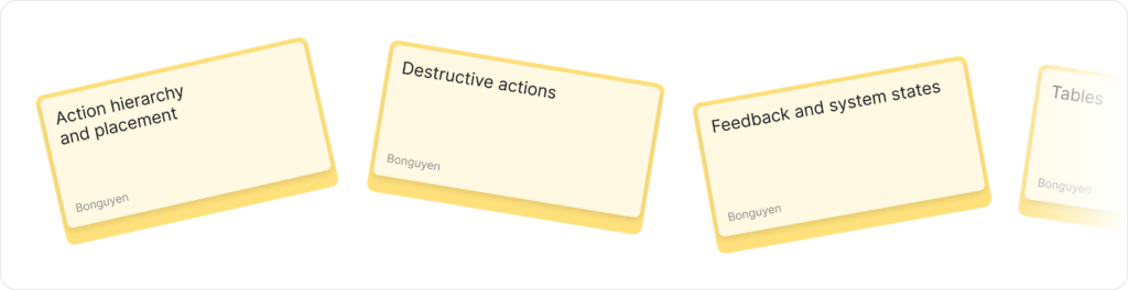
Components define what users interact with, while UX Patterns define how those interactions should work.
The CPS Design System includes a collection of reusable UX patterns that provide standardized solutions to recurring design problems across the platform. These patterns document common user flows, interaction behaviors, and system responses, ensuring that similar scenarios are handled consistently regardless of which Scrum team develops the feature.
By establishing shared UX patterns, designers can make decisions more efficiently, developers have clearer implementation guidance, and users benefit from a predictable and coherent experience throughout the product.
Documentation
A Design System is only valuable if people know how to use it.
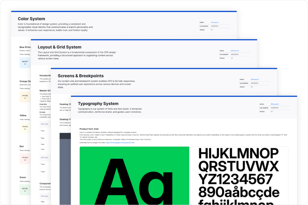
To encourage adoption across multiple Scrum teams, I created comprehensive documentation covering design principles, component usage, naming conventions, UX patterns, and implementation guidelines.
This documentation serves as the single source of truth for designers and developers, making it easier to onboard new team members, maintain consistency, and evolve the Design System as the product continues to grow.