Overview
My role: Product Designer, Researcher
Flatform: zim.vn website
Tool: Figma, Google Analytics
Result: +78.26% (~3.91% -> ~6.97%) conversion improvement
Background
ZIM offers a free English placement test that helps learners evaluate their current proficiency level and receive personalized course recommendations. As one of the company’s primary lead generation channels, the placement test played an important role in converting website visitors into potential customers
During a monthly business review, the marketing team presented the registration performance of the placement test flow. While the conversion rate was considered acceptable, I noticed unusually high drop-off rates across multiple steps of the funnel. To me, this indicated that users were encountering friction during the registration process and that the experience had significant room for improvement.
Rather than accepting the conversion rate as “normal,” I initiated an investigation to understand why users were abandoning the flow. Through funnel analysis, user interviews, and UX evaluation, I identified several friction points that were preventing interested users from completing registration.
Based on these findings, I redesigned the experience into a more guided and streamlined registration flow. The redesign increased registration conversion by 78.26% and maintained its performance for nearly a year after launch.
Why This Project Matters?
The English placement test was one of ZIM’s most important lead acquisition channels, generating approximately 2,500 registration attempts per day. Users who clicked the placement test CTA had already demonstrated a strong intent to learn more about ZIM’s courses. However, a large percentage of these interested users abandoned the process before completing registration.
Although the existing conversion rate was viewed as acceptable by stakeholders, I believed the funnel data told a different story. The high abandonment rates suggested that users were struggling with the experience rather than losing interest in the service itself.
By identifying and removing these friction points, the project had the potential to improve both the user experience and a key business metric: lead generation.
Design Goals
- Increase lead conversion
- Reduce friction throughout the registration flow
My Impact
Using data analysis, User Research, and A/B testing, I collaborated with marketer, teacher & developer to propose and implement optimized solutions. Ultimately, I delivered high-fidelity UX interaction designs along with research findings and detailed design specifications. These efforts resulted in a significant improvement in conversion rates
Design overview
Key improvement: Registration flows, Visibility, Visual.
Discovering the Problem
Following the Design Thinking approach, I first experienced the registration flow myself to better understand the user journey and identify potential friction points.
After reviewing the flow, I formed a initial hypotheses about where users were dropping off: Users were hesitant to provide personal information due to being lack of trust
- Mismatch title and the action: The title is registered for English placement test, instead of showing user a calendar or placement test information for user, zim asked for user contact information right away
- Unclear register steps: The main step of showing information of placement test is hidden away at the end and there’s no sign telling user that
- The fear of being spammed: Fear of being spammed is a common thing since data privacy is not a thing nowadays, not to mention asking for contact information right at the get go is a common sign of a brand that just want to get your information
- Other resistance: OPT verification
Research & Validation
Before proposing any design changes, I wanted to understand whether the low conversion rate was caused by user intent or by friction within the registration experience. To validate the problem, I combined quantitative data from Google Analytics with qualitative feedback gathered through user interviews.
I analyzed the registration funnel using Google Analytics to identify where users were abandoning the process. The original flow required users to:

Across the year of 2023, the funnel consistently showed significant drop-off throughout the registration process.
| Funnel Step | Users | Completion Rate | Abandonments | Abandonment Rate |
| Open info modal | 28,380 (100%) | 18.0% | 23,272 | 82.0% |
| OTP Verification | 5,108 (18.0%) | 68.0% | 1,635 | 32.0% |
| Open Test Form | 3,473 (12.2%) | 32.0% | 2,363 | 68.0% |
| Lead | 1,110 (3.91%) | — | — | — |
Conversion Funnel Performance
Analysis of user progression and drop-off rates across key funnel steps.
Average conversion remained around 3.65%, indicating that only a small percentage of interested users completed registration.
While the analytics data revealed where users dropped off, it could not explain why they abandoned the process. To better understand the reasons behind the behavior, I conducted user interviews and did some surveys. The following key issues were identified:
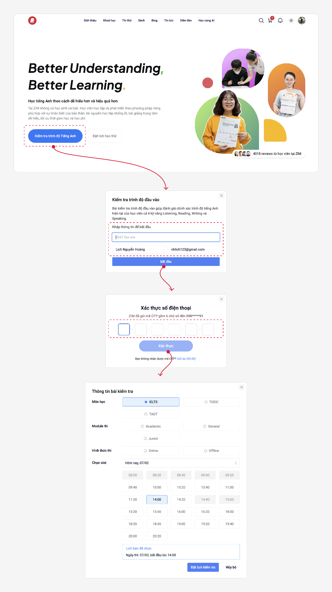
1. Open and fill in info form
Issue 1: Mismatch Between User Expectations and Landing Experience
Users expected to start the placement test or register for a test session after clicking the CTA. Instead, they encountered a lead capture form, causing confusion and increasing the likelihood of abandonment.
“I thought when I click the button, it will show me a booking popup to let me register the test and schedule information or I will do a test online. But instead of that I only see a input form require me to fill in my contact information”
Issue 2: Unclear Registration Process
The course and test registration is hidden as a second step, with no prior indication to the user.
Issue 3: Lack of Trust in Sharing Personal Information
Users were hesitant to provide their personal information because they were unsure how it would be used after submission. Many participants expressed concerns about receiving unsolicited sales calls, promotional messages, or spam.
OTP Verification
Issue 4: OTP add additional friction
The OTP verification step introduced additional effort into the registration process and disrupted the user journey. Some users experienced delays in receiving the verification code.
- Placement test Registration
Issue 5: The booking interface is not user-friendly and feels confusing to navigate.
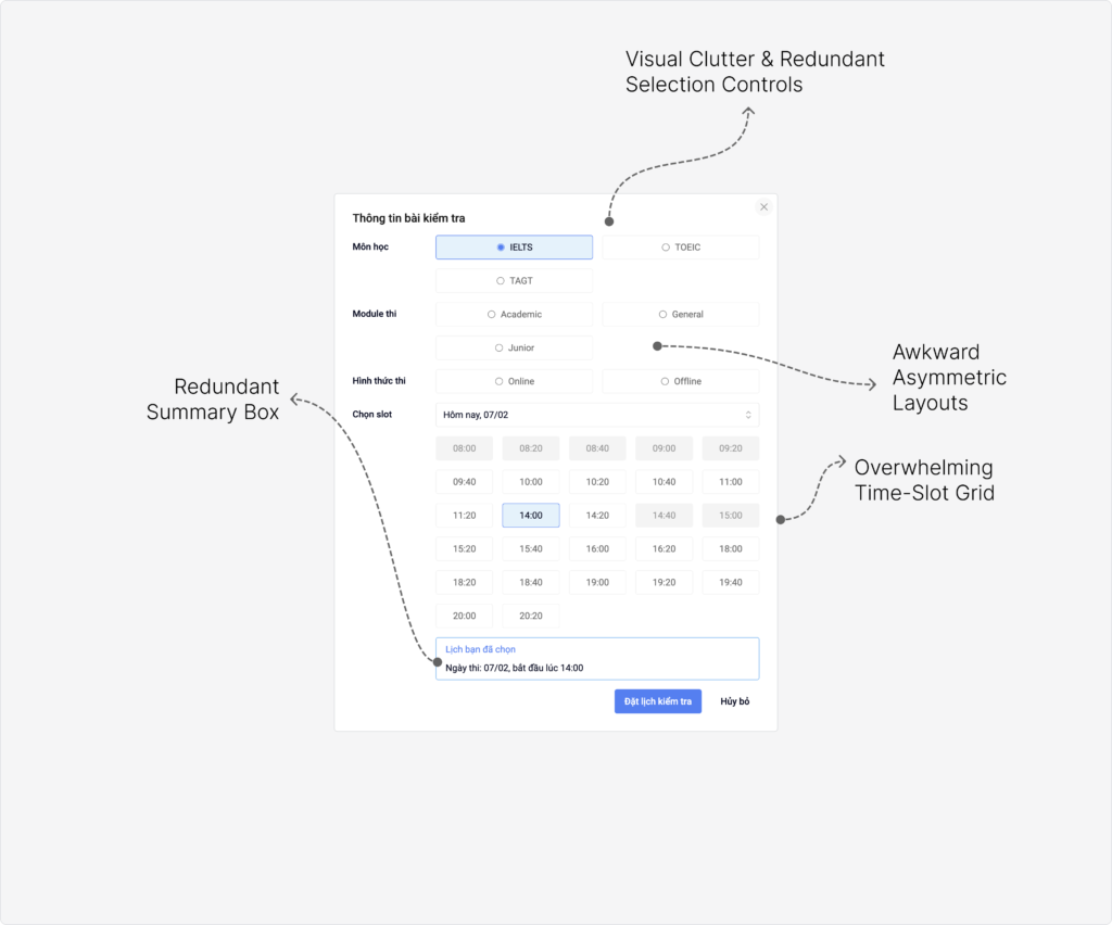
Issue 6: Users couldn’t find a schedule that fits my availability.
Constraints
- Contact information is essential for the business and could not be removed from the flow.
- Although Phone verification created addition friction, but it was also a required business process. It ensure the quality of the lead, avoid spam and false contact information
- Placement test must be have a teacher to observe and oversee the process
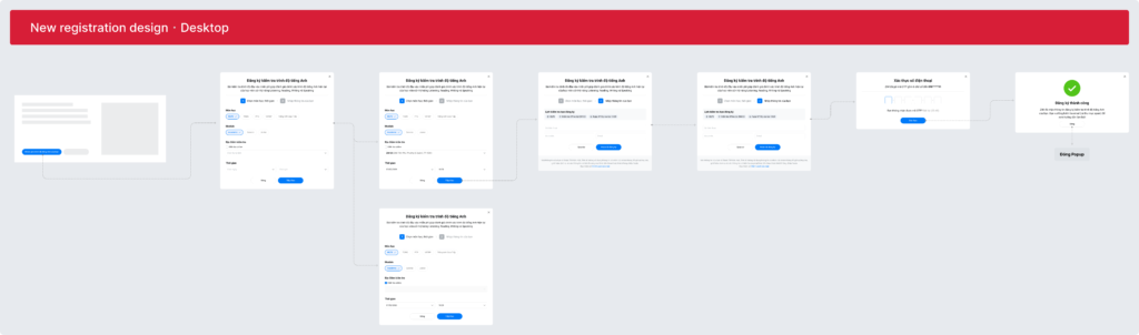
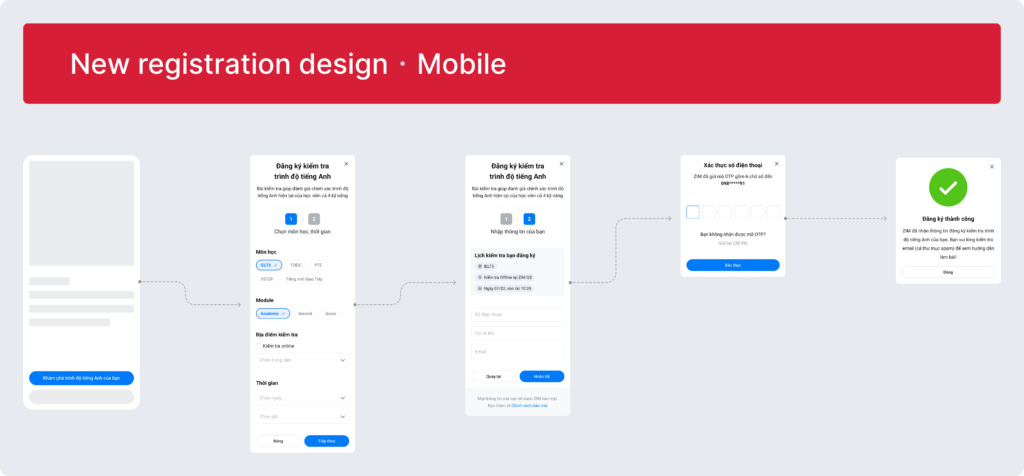
Solution Strategy
Solution 1:
Refine button labels and modal header titles to ensure consistent meaning and improve clarity.
Solution 2:
Reposition the “Test Form” as the first step in the flow. This helps align the modal with user expectations by:
- Reducing the pressure of immediately providing personal information
- Allowing users to engage with the form more comfortably
- Creating a gradual commitment flow instead of requiring instant commitment
- Capturing user intent earlier in the journey
Solution 3:
Add a stepper component to:
- Improve visibility of progress
- Reduce uncertainty
- Help users better understand the overall process
Solution 4:
Add data privacy reassurance messaging to reduce trust concerns.
Clearly explain how user information will be handled, helping reduce anxiety around sharing personal contact details.
Solution 5:
Simplify the Placement test Registration UI to make it cleaner, more intuitive, and user-friendly.
Solution 6:
Allow users to select any preferred time slot, even if it is not currently available.
Instead of restricting options, the system records user preferences and allows staff to follow up and reschedule later.
Final Design
Testing & Result
1. A/B Testing
To make sure that solution is working as I expected I use A/B testing to measure and compare the effectiveness between current design and my new design. With A as current modal design and B as my new modal design. I ran the A/B test for 3 months, here’s the data of the A/B testing of Jan, Feb and Mar
A/B testing data table
| Month | A Traffic | A Leads | B Traffic | B Leads |
| Jan | 1,315 | 52 | 1,325 | 92 |
| Feb | 538 | 25 | 532 | 42 |
| Mar | 1,060 | 43 | 1,070 | 68 |
| TOTAL | 2,913 | 120 | 2,927 | 202 |
| Metric | Old Design (A) | New Design (B) |
| Users (Traffic) | 2,913 | 2,927 |
| Leads | 120 | 202 |
| Conversion Rate | 4.12% | 6.90% |
| Absolute Increase | — | +2.78 pp |
| Relative Improvement | — | +67.5% |
The redesign successfully achieved its primary goal of improving lead conversion. Following the launch, conversion increased by 67.5% compared to the original design. Analysis over the following year confirmed that the improvement was sustainable, with the average conversion rate rising from 3.91% (2023) to 6.97% (2024), representing an overall 78.26% increase.
Conversion Rate Trend: 2023 vs 2024
Reflection
This project taught me that improving conversion is not only about visual design, but also about understanding user psychology, trust, and perceived effort.
Small UX decisions — such as the order of information requests or visibility of progress — can significantly affect user behavior and business outcomes at scale.
More importantly, this experience reinforced my belief that product designers should not only execute requirements, but also proactively identify opportunities for improvement through research, critical thinking, and experimentation.